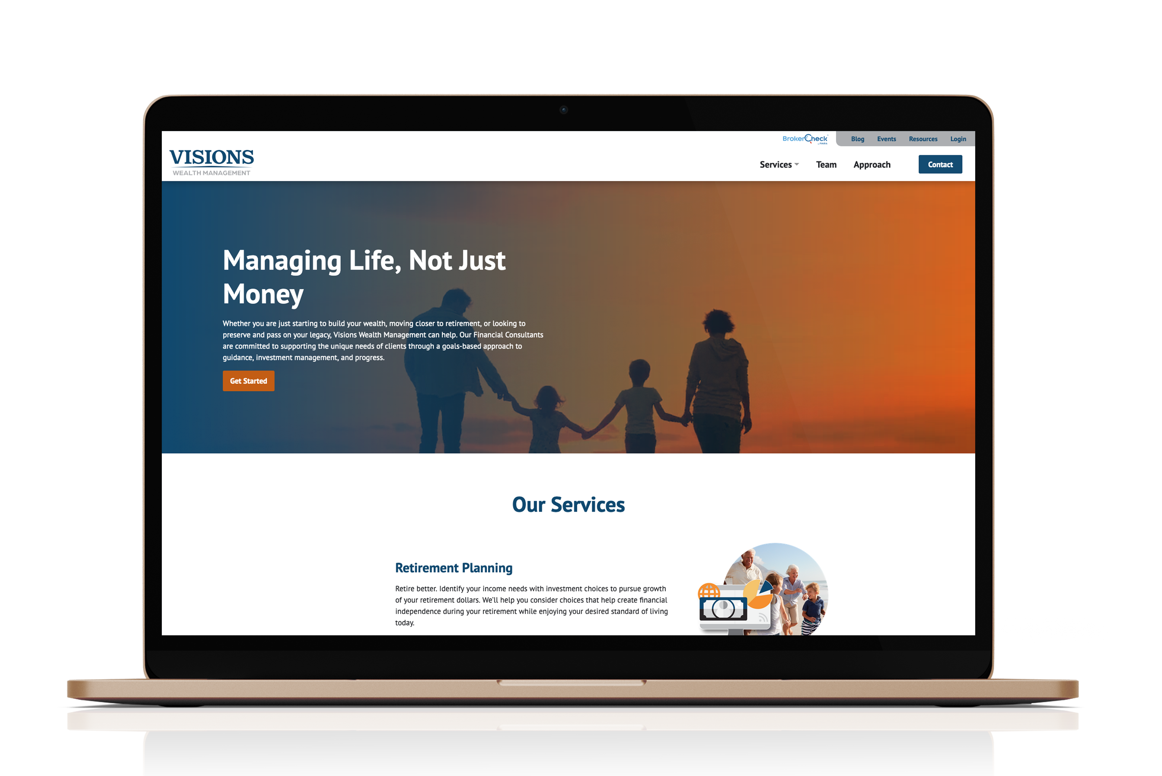
This was a large financial-services site with a lot of content and several different audiences. My job was to help turn that into a site that felt organized and worked well across screen sizes.
The focus
The main challenge was giving people a clear way through all of the services and information. We used repeatable page layouts and a straightforward hierarchy so the site could hold a lot without feeling difficult to use.
What I worked on
- Front-end implementation across responsive layouts
- Reusable page and content components
- Navigation and call-to-action behavior
- Cross-device polish and quality assurance
It was a good exercise in working through the less-visible parts of a big site: consistency, responsive behavior, and making sure the system still worked as more content was added.